A Clearer Credit Experience
CASE STUDY · FINANCIAL SERVICES
Simplifying the credit management experience
- Role
- UX / Product Designer
- Industry
- Financial Services
- Organization
- Solo project
Redesigning a mobile credit experience to make everyday account management clearer, more accessible, and easier to navigate. The project explores how customers can confidently access account information, manage payments, and complete essential financial tasks through a more intuitive digital experience.
EVIDENCE AT A GLANCE
7
Journey stages
3
Competitors
10
UX heuristics
THE CHALLENGE
Making Credit management simpler, clearer, and more accessible
Customers faced a fragmented experience across credit applications, payments, and account management. Limited visibility into balances, confusing financing terms, and dependence on customer support made everyday financial tasks unnecessarily difficult.
The challenge was to create a unified mobile experience that gives customers greater clarity, confidence, and control over their credit accounts.
Key challenges identified
01. Limited financial transparency
- Customers struggled to understand outstanding balances, minimum payments, promotional financing terms, and what they actually owed.
02. Fragmented customer journeys
- Credit applications, account setup, transactions, and payments involved disconnected touchpoints, creating friction across the customer lifecycle.
03. Lack of self-service capabilities
- Customers relied on customer support for essential account activities, including resolving card issues and accessing information they expected to manage independently.
04. Building trust through usability
- Confusing information, authentication friction, and limited transaction visibility created opportunities to improve confidence and reliability in the mobile experience.
RESEARCH & DISCOVERY
Understanding the customer journey and uncovering experience gaps
We examined the end-to-end credit journey to understand where customers experienced confusion, friction, and limited control. Through journey mapping, competitive benchmarking, and heuristic evaluation, the team identified opportunities to simplify account management and prioritize essential mobile experiences.
Mapped seven stages, from awareness and application to payments, account management, and recurring purchases, identifying customer actions, touch points, weaknesses, and opportunities.
Analyzed American Express, Chase, and Capital One to understand established interaction patterns, customer expectations, and gaps in financial mobile experiences.
Evaluated competitor experiences against 10 usability heuristics, examining navigation, payments, account visibility, security, and other essential tasks.
DESIGN STRATEGY & PRIORITIZATION
Turning research insights into a focused Mobile experience
The research revealed opportunities across the customer journey, but not every feature needed to be part of the initial release. The team translated customer pain points into a prioritized feature roadmap, focusing the MVP on financial transparency, account accessibility, and essential self-service capabilities.
From customer pain points to design priorities
Customer pain point
Unclear balances and payment obligations
Difficulty finding purchases and transactions
Dependence on customer support
Authentication and account-access friction
Design priority
Clear account summaries and payment information
Accessible transaction history
Self-service information and contextual help
Simplified access through biometric authentication
Defining the MVP
- Biometric authentication
- Current balance and credit limit
- Transaction history
- Account and card details
- Minimum payment summary
- Promotional information
- FAQs and support information
THE DESIGN PRINCIPLE
Prioritize what Customer need to know and do, before adding more features.
The strategy established a foundation for a mobile experience centered on clarity, simplicity, and customer control, while leaving room for future capabilities.
UX DESIGN & SOLUTION
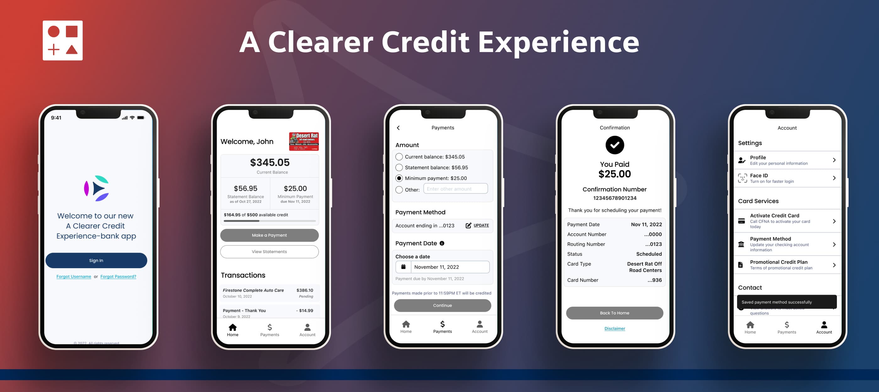
Designing a simpler, more intuitive credit management experience
Building on research insights, we translated prioritized customer needs into a mobile-first experience focused on clarity, accessibility, and control. The design approach emphasized simplifying essential financial tasks, reducing unnecessary steps, and making account information easier to understand.
Simplified account overview
Essential financial information at a glance: A consolidated dashboard brings key account details into one place, helping customers quickly understand their financial position and identify their next action.
Design focus: Current balance, available credit, minimum payment, payment due date, and prominent payment actions.
Streamlined payment experience
Making payments clear and predictable: The payment experience was structured around straightforward actions and understandable financial information, helping customers navigate payments with greater confidence.
Design focus: Clear payment amounts, payment method selection, due-date visibility, and confirmation feedback.
Accessible transaction history
Helping customers understand their account activity: A structured transaction experience makes it easier to review purchases and payments, with information organized to support quick scanning and account awareness.
Design focus: Transaction details, payment history, and clear presentation of account activity. Advanced search and filtering were identified as future opportunities.
Secure and effortless account access
Reducing friction without compromising security: Biometric authentication was prioritized to simplify repeat access while supporting the security expectations associated with financial applications.
Design focus: Face ID, fingerprint authentication, clear login states, and account recovery pathways.
Self-service and contextual guidance
Giving customers greater independence: The experience prioritizes access to essential information and help, reducing the need to contact customer support for common questions.
Design focus: FAQs, contextual guidance, account information, and clear support pathways. More advanced self-service actions were planned for later releases.
DESIGN DECISIONS & INTERACTION DETAILS
Making complex financial task feel effortless
Beyond visual simplicity, the design focused on helping customers understand their account status, recognize available actions, and complete essential tasks with confidence.
Prioritizing account balance, available credit, and payment obligations helped establish a clear visual hierarchy, allowing customers to identify important information without navigating through multiple screens.
Essential tasks such as making payments, reviewing transactions, and accessing account information were prioritized to support faster, more predictable navigation.
Detailed financial information and secondary actions were organized to keep primary screens focused, while allowing customers to explore additional details when needed.
Biometric authentication, understandable instructions, and clear feedback were incorporated into the design direction to support confidence during sensitive financial interactions.
OUTCOMES & IMPACT
Creating a foundation for a more Confident credit experience
The design work established a customer-centered direction for the mobile application, translating research findings into prioritized features, clearer account interactions, and a more consistent experience.
Clearer financial visibility
A design direction that prioritizes balances, payments, and account information.
Focused MVP strategy
Customer pain points translated into essential features and future enhancements.
Stronger self-service direction
Clearer pathways to account details, transaction history, and support information.
Scalable experience foundation
A prioritized roadmap supporting additional account-management capabilities.
REFLECTION & KEY LEARNINGS
Balancing customer needs with business priorities
This project reinforced the importance of understanding the complete customer journey before defining solutions. It highlighted how research-driven prioritization can simplify complex financial experiences while creating a foundation for future growth.
Key learnings
1. Understand the journey, not just the interface
Mapping the customer journey helped identify pain points beyond individual screens.
2. Prioritize clarity over complexity
Financial experiences benefit from making essential information visible and actions easy to understand.
3. Design for immediate needs and future growth
Separating MVP priorities from future opportunities helped maintain focus without losing the broader product vision.
Great financial experiences aren't about adding more features. They're about helping customers understand their finances and take action with confidence.
IF YOU GOT THIS FAR…